Project Juice
We were so excited to work with Project Juice on their second retail space. Located on the desirable corner at Green and Polk in San Francisco, this is their first storefront space.
They serve up some delicious, healthy, and unique flavors. Best of all, they do frequent tastings of their incredible flavors and they’re open NOW!
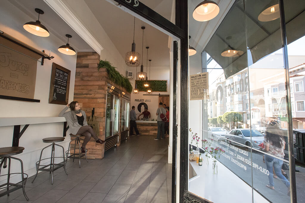
This space was previously a dry-cleaning drop off space, so we started with a clean interior space. By installing a few simple partitions, putting in some new flooring and wood surrounds for their refrigerators, we used a minimal approach to the design to create a backdrop to their colorful pressed juices.
We started this project with the concept of doing brightly colored graphic art showing the fruits smashing and merging into one another. Our client, however, wanted to keep the interior simple, with the colorful elements provided by natural landscaped green walls and the actual juice product itself.
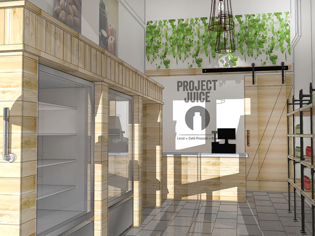
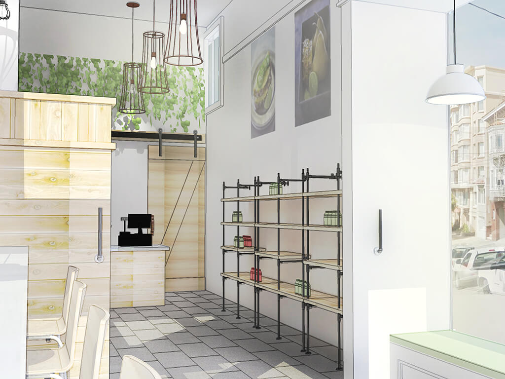
We produced a series of interior renderings for this space at various stages of design until we got the exact vision they wanted to achieve. You can see by the images how close the renderings are to the finished product. We couldn’t be more pleased with the end result.
Another exciting opportunity for this space was the large sidewalk outside. Keep an eye out for the outdoor tables and chairs coming soon along Green Street!
Credits
-
Owner:
- Project Juice
http://www.projectjuice.com/
- Project Juice
-
Photography:
- Marta Felix Photography (coming soon)
http://www.martafelixphotography.com/
- Marta Felix Photography (coming soon)
-
-
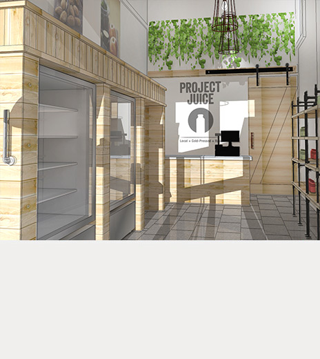
 Shown on the bottom left was our final rendering for the space. Pretty close to the finish product, don’t you think? Ultimately, the wood we selected was a deeper, more rustic style than the blonde wood we rendered, but the 3d model was a terrific tool in helping our client envision the space.
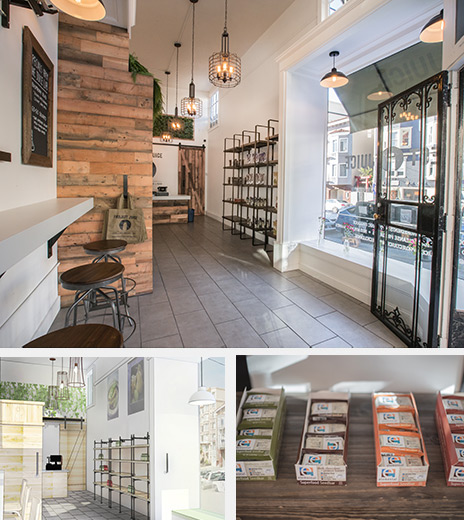
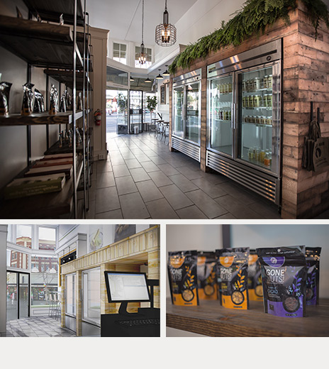
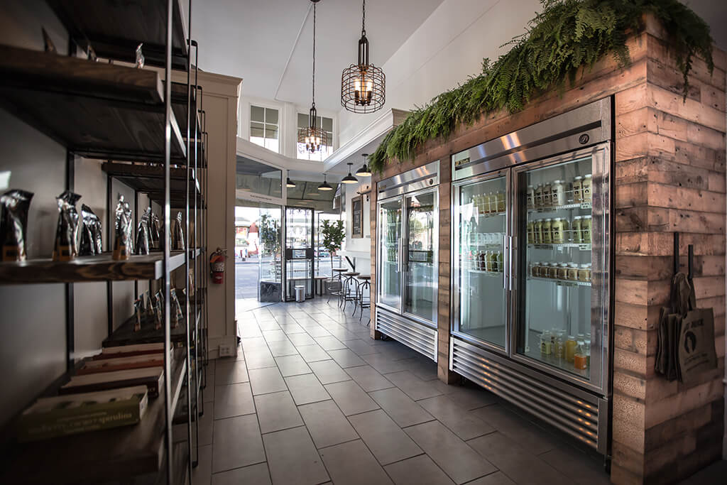
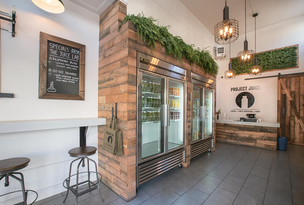
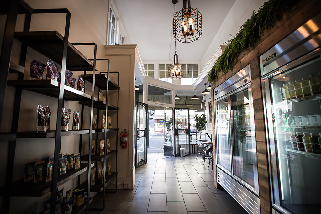
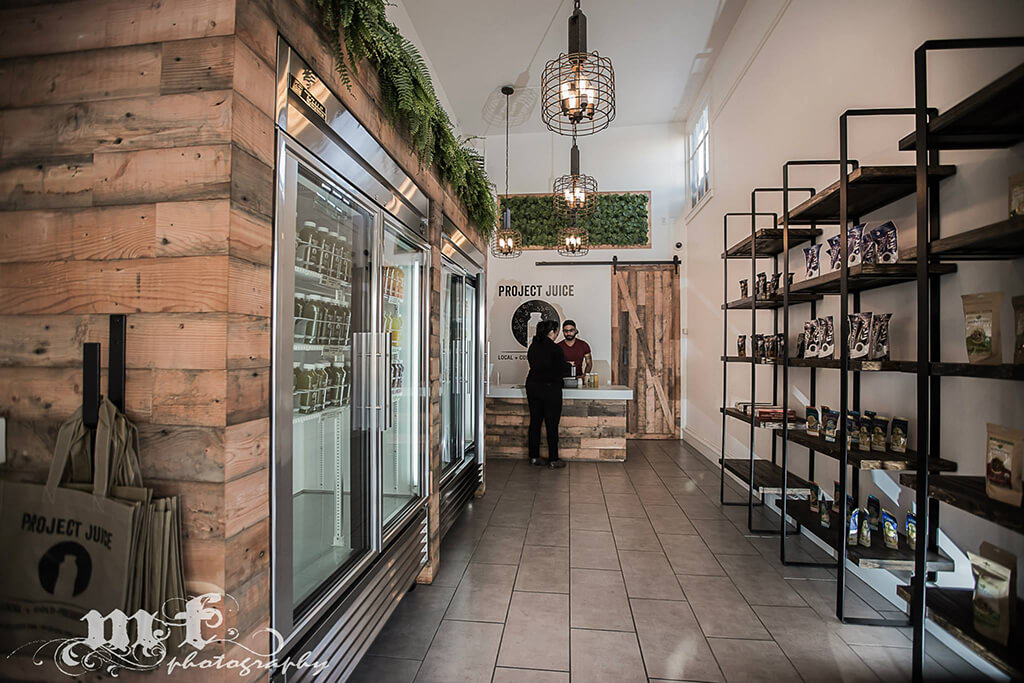
The floor is a porcelain tile made to look like concrete. We also played up the more industrial/rustic style with caged lights and pipe rail hooks and shelving elements throughout. -
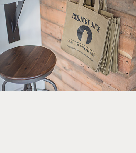
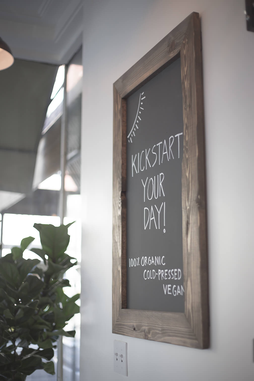
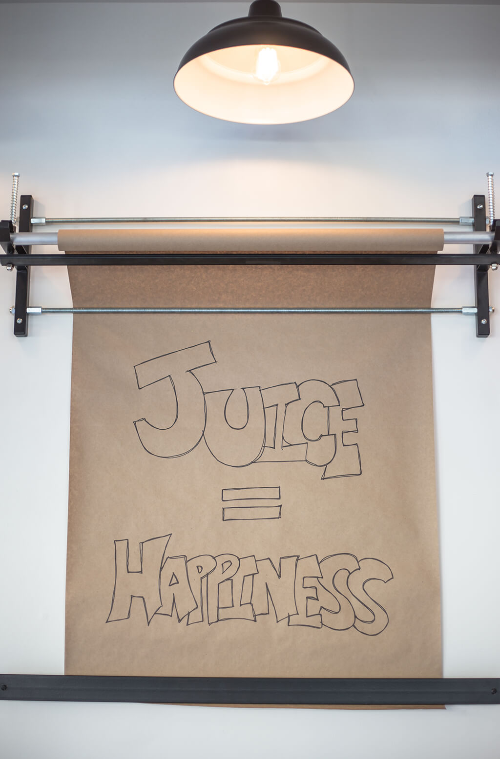
 For this space, the seating was secondary to the retail component. A small area of counter seating was provided just at the entrance. Directly above the seating area is a chalkboard and a roll of butcher paper to highlight the products of the day or just allow people to leave inspirational messages.
-
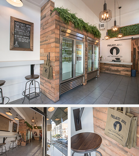
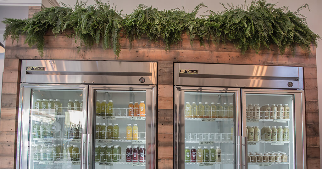
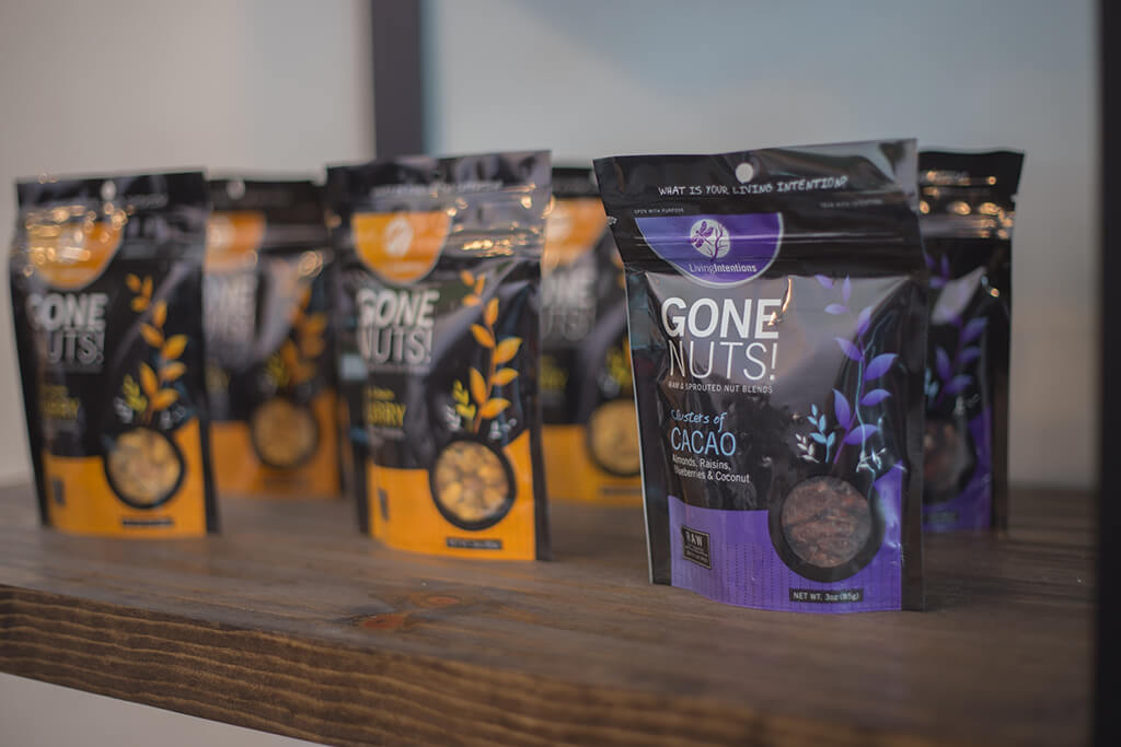
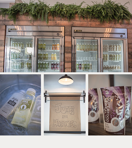 Although it looks more complex, the strongest feature in the space are the wood surrounds at the new refrigerators. They are really just a simple wood frame with raw lumber attached to the outside. To highlight the natural quality of their products, our client also installed plants atop the refrigeration equipment.
-
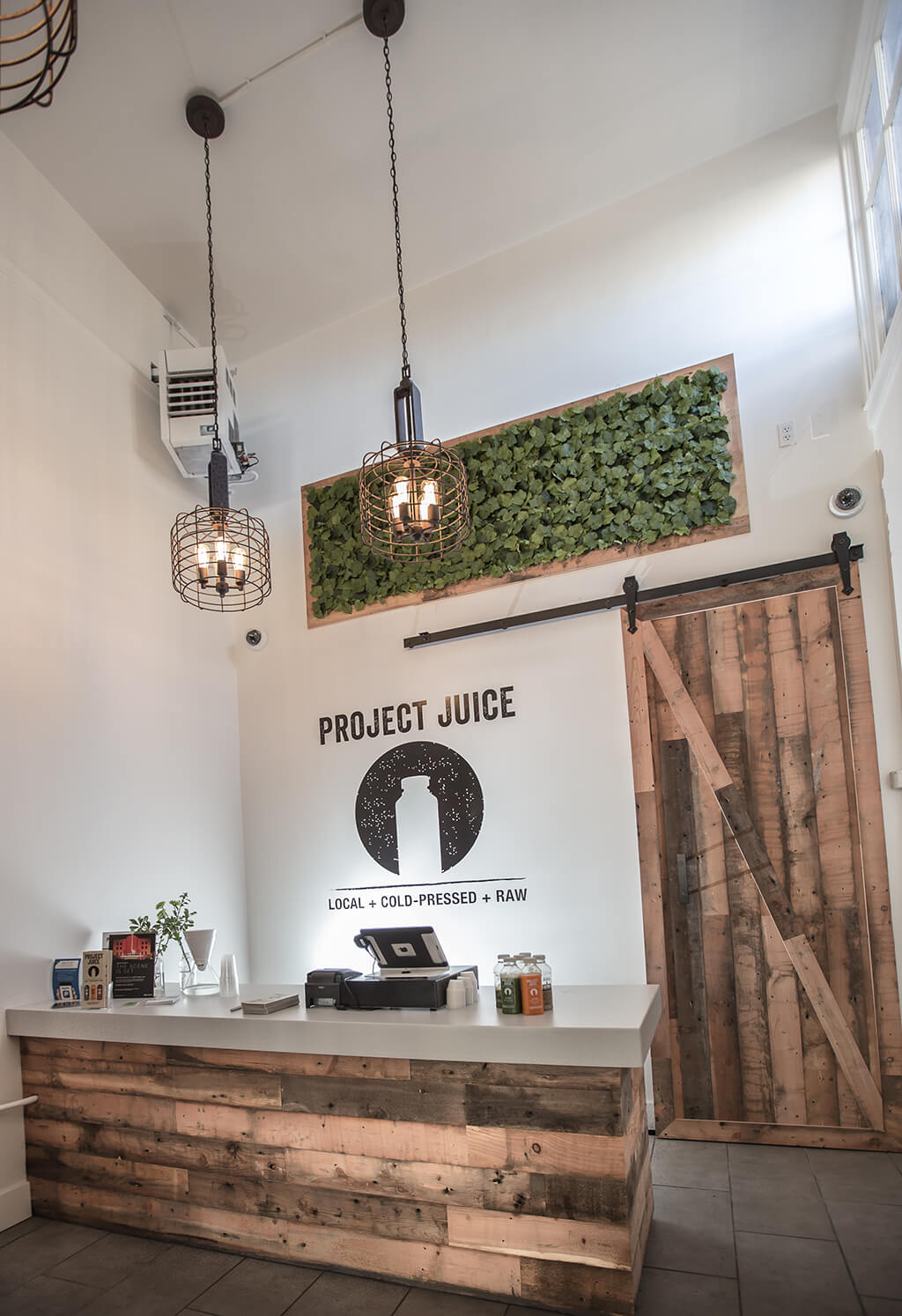
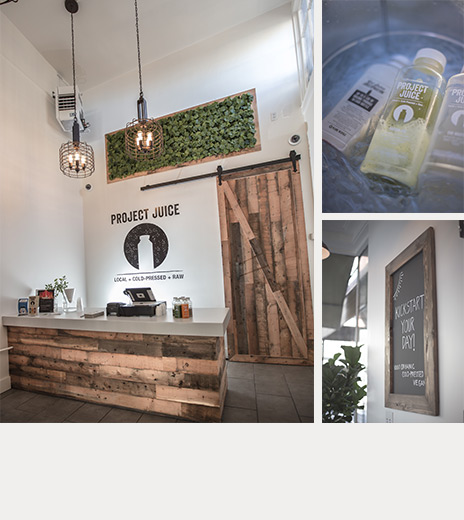 The sales counter, located at the back, also serves as the dividing point between the public and private areas. The barn door you see here conceals the back storage and office areas from view, but fits in seamlessly with the aesthetic of the space.
-
 Again, you can see how our rendering in the bottom left matches the finished product of the build-out. This vantage shows the view from the sales counter out to the street corner.
-
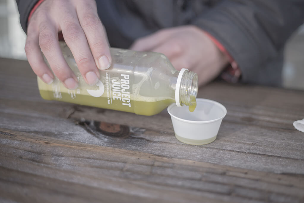
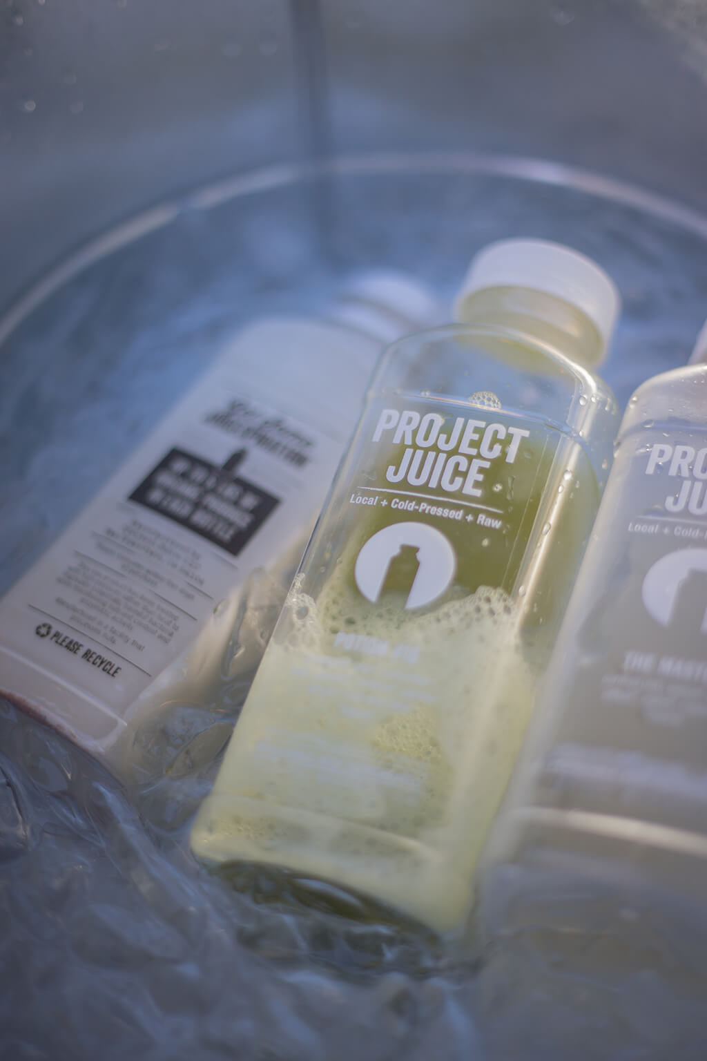
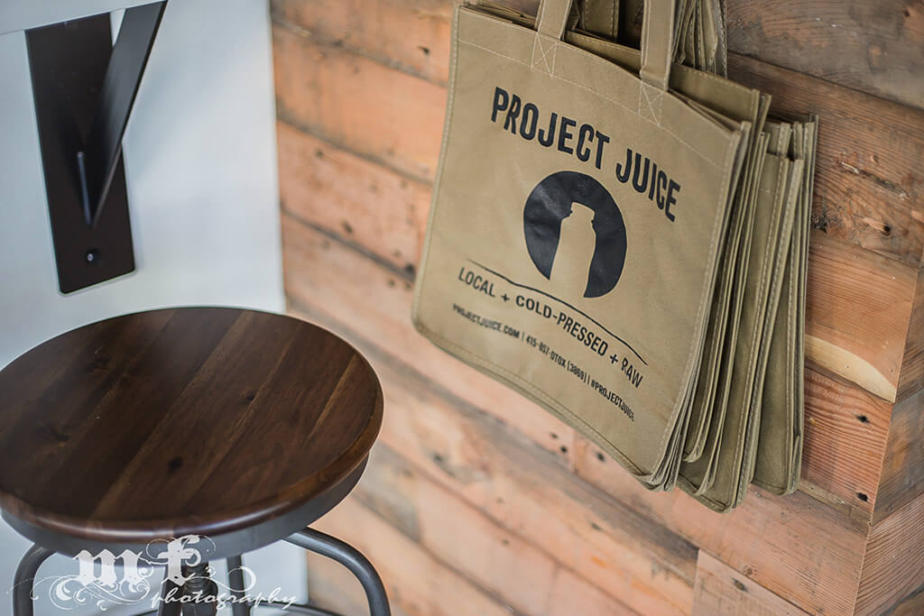
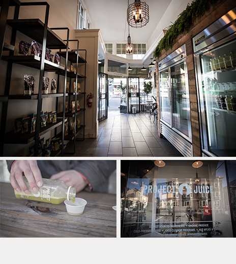 We’ve tried their juices first hand and can vouch for how delicious and fresh they are. The flavor combinations and merging of fruits and vegetables are incredibly unique, but also very balanced. You can pick up a single bottle, or buy a whole cleanse package. They change the flavors seasonally, so you’ll never get tired of the flavors. We hope you stop on in and give it a try!
-